Well, it’s been a really long road, but all the formatting and cover art business for A Shadowed Spirit is finally coming to an end. Normally it wouldn’t have taken so long, but along with getting A Shadowed Spirit ready for publication, we’ve also been reformatting The Thirteenth Tower due to changing printers. We’ve also made some adjustments to the back portion of the cover to help keep it a bit closer to A Shadowed Spirit. It literally created twice as much work, and I’ve been in a “I just need to get this done” haze for the past two months.
Anyway, did I say it’s almost done? Please excuse me while I go laugh/cry hysterically in the corner while petting my hair as I recover from it all. As hard as writing can be sometimes, compared to publishing, writing is like rocketing yourself out of a cannon while coated in baby oil. And on that image…
To celebrate the almost-doneness of publishing A Shadowed Spirit, it’s time to share the creation of the cover art. Woohoo! I love this bit. I did the same thing for The Thirteenth Tower. Ferdinand D. Ladera is such a talented artist, and it’s fantastic he does commissions and, more importantly, continues to graciously put up with my particularities with such good humor. Thank you, Ferdinand!
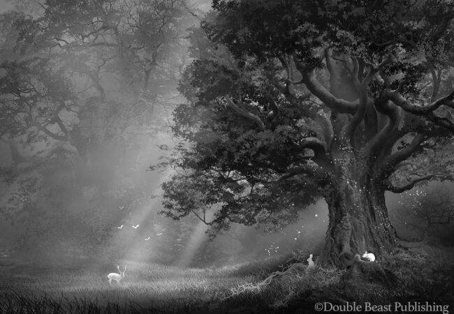
Anyway, let’s get started. Like before, I’ll start with the black and white sketches first. Part two of the post will feature the color studies. After giving a general description of what I was looking for, this is what Ferdinand sent over:
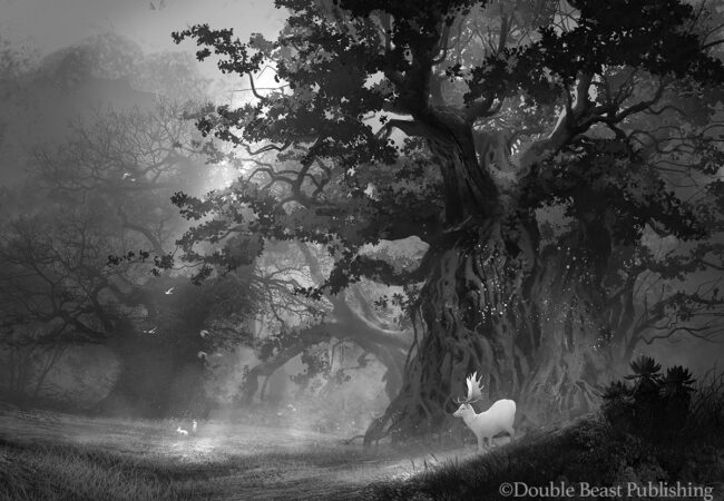
So incredibly stunning that I was really excited from the get-go. I liked the version with bunnies in the foreground better than the other one, but that tree (as stunning as it is) was just too big. The tree itself needed to be more of a focal point for that half of the picture–which will essentially be the front cover of the book.
So we went through a few iterations of getting the tree shrunken down and looking right.
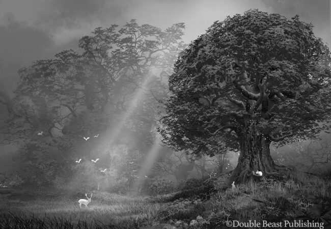
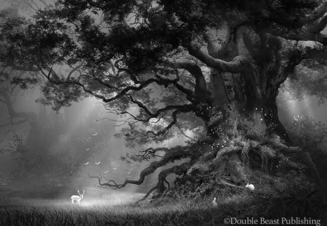
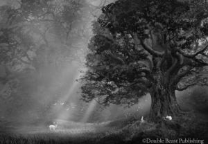
I really liked the second image in the slide, and so that’s the one we settled on, with a few slight adjustments to the branches:
At this point, I was thinking we were good to go. But we asked around, and it was pointed out that it would be better if there was a person in the picture to serve as a focal point (and to make it less Disney-looking with all the woodland animals). I wasn’t sold on the idea at this point, but figured it couldn’t hurt to try it and see how it looks. We thought it would be good to make the person a shadowy figure, so as to tie it in with the title.
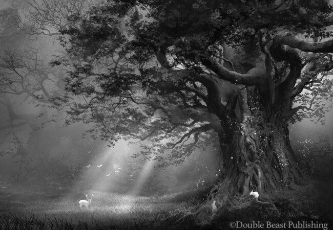
After a little bit of trial and error, this is what Ferdinand came up with:
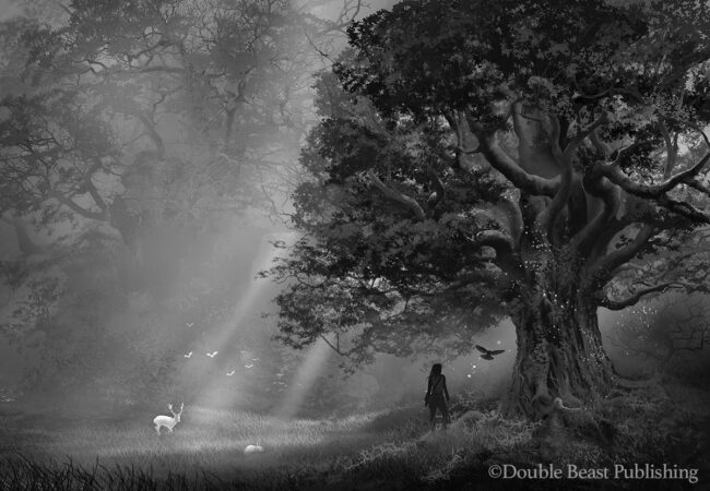
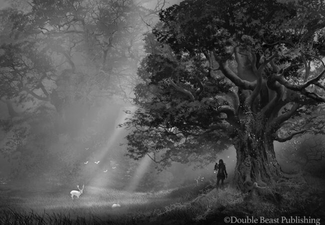
Which surprisingly, I really liked. I also really liked that we worked the falcon in the image, since he is in the story (and on the first cover as well). But I honestly couldn’t decide between the two, because I think they’re both really great and work well. Anders liked the first one better, so we chose that one. And so that’s the black and white version of the cover.
In the second part of the post, I’ll go over the rather painstaking process of adding color to the image. Stay tuned!
This is already gorgeous in gray scale, I can’t imagine the colored version. Though I liked all of them, I like the one with the flying falcon the best. I am certain the final cover is going to be stunning.
The grey images are really amazing. There’s a certain drama that just gets lost when color is added. Glad you like the flying falcon one, though, as that’s the one we picked! 😀
I agree – the one with the flying falcon is perfect. The art work in all of these is truly inspired; bravo, Ferdinand!
Thanks, Lori! 🙂
LOVE! Sara! This is gorgeous. i can’t wait to read it too. Your covers are always stunning.
Thanks, Katie! It’s great to see you. 🙂
I love this! The forest setting and the trees are to die for. 🙂 I’m looking forward to reading the book.
Thanks, Michelle, and I agree. I want to go there! 😀
Wow, those are all lovely! What an amazing artist!
Thanks, Lori. He really is amazing! You should check out his portfolio if you haven’t already.
This is so gorgeous, Sara! My compliments to the artist. 🙂
Thanks, Sue. Ferdinand is amazing. 🙂
Wow, that looks like a beautiful cover.
And I’m happy your collaboration with your cover artist worked so well. It wasn’t lika that with mine. I mean, she was nice and everything, but after a while I got the impression she was bored with the process.
I’m sorry that happened.
But you were very lucky. going over to the next post 🙂
Sorry to hear that about your cover artist. I do think I’ve been pretty lucky so far in that regard. Thanks, Sarah. 🙂