In part one we went over the evolution of the cover art for A Shadowed Spirit in black and white, created by the talented Ferdinand D. Ladera. Now, in part two, we’ll go over the color variations of the final black and white image. I have to say, this was the most challenging aspect. I think it was because I had particular demands for the coloring of the tree, and it was difficult finding a way to accommodate that as well producing a visually appealing image.
The first color study Ferdinand sent over was his interpretation of the image, before I had a chance to give him any of the particulars. It was lovely, but not quite what I was looking for.
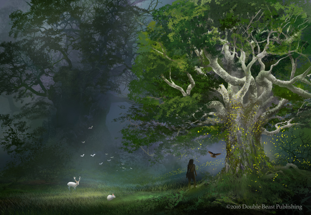
The background coloring I thought was great. It was really just the tree that needed adjustment. It needed to be white, for story reasons. (Those who read The Thirteenth Tower might know why.) I provided Ferdinand with color suggestions for the tree bark and leaves (again, based on story descriptions), but it didn’t really translate well.
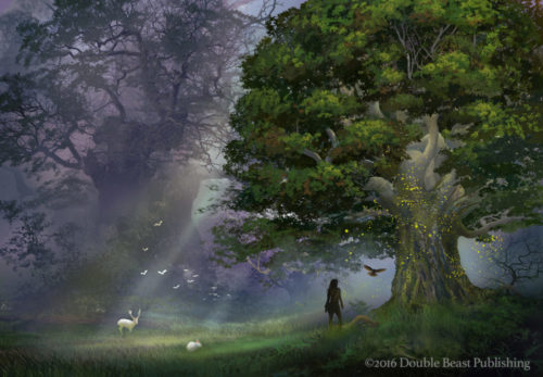
It just didn’t look right, in a way that’s hard to pinpoint (and therefore fix), other than it being too jarring, too bright. That led to a series of alterations, of trying different things to see how they worked. (Click images to enlarge.)
[one_fourth_first]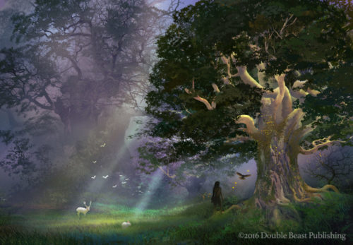 [/one_fourth_first]
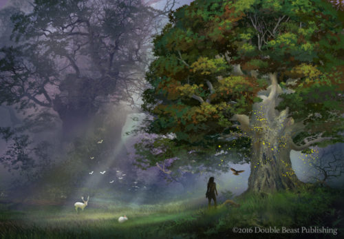
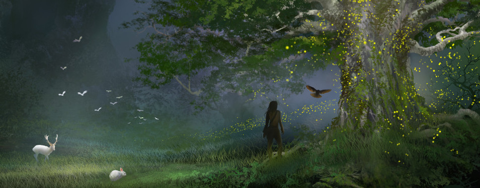
With that last image, I felt like we were getting close. Even though I liked the previous, purpley background, this one seemed to work better. It felt more twilighty, which I found appealing especially in regards to the title. The coloring of the tree also seemed like it was getting there. It was pale, but not the in-your-face white that just didn’t work. I realized at this point that the previous white coloring might have worked with a bit more aggressive shading on the branches. But that just didn’t occur to me at the time. Got to love hindsight.
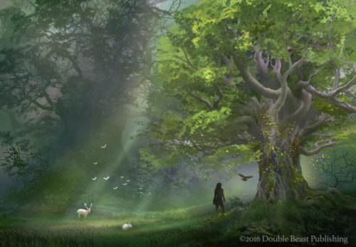
So, with a bit more tweaking, this is what we got:
And that was it. I was pretty pleased with that. Of course, by this time, I’d seen so many variations over an extended period that I no longer really trusted my own judgment anymore. But Anders also liked it, and his sister gave us a thumbs up. So we approved it. Cue cheers of joy and a long, weary sigh. For me, I often don’t know how I feel about something until enough time has passed for me to “forget” it. Then when I see it again (or read it again, because this most certainly also applies to my writing) then my feelings become clearer. And this was true for the cover. But I’m feeling optimistic, because every now and then I’ll see the final cover (complete with the title) and I feel happy. I think, “that looks pretty good” and so overall I’m really pleased with the outcome.
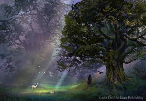
What’s that, you say? You also want to see the final final image with the title and all? Happy to oblige.
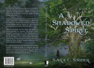
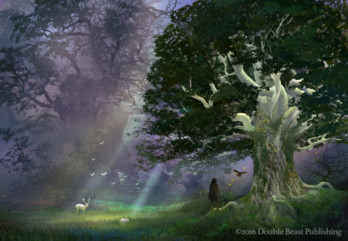
And here’s a 3D image of the cover. You know, for science. I like this image because I feel like it gives a good indication of what the print copy will look like (which, FYI, I’m currently awaiting from the printer as I write this — woohoo!).
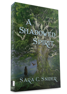
So there it is. The cover art for A Shadowed Spirit, which is now due for release on May 17th. I’m so happy this whole process is almost done, you have no idea.
What do you think of the cover? Please share your thoughts in the comments below!
I actually got goosebumps from the final image. It totally brought back all the emotions from the first book, and how things stand in the story.
Looking through the evolution of the images I felt that the lighting in the background needed to emanate from the tree itself, and that is exactly where Ferdinand took it. That, plus the addition of magic sparklies around the tree, really brought it to life. Well done!
Whoa, awesome! That’s great to hear. 🙂 It does look like the light is emanating from the tree, which is doubly great because I don’t think I actually specified that detail. Ferdinand is just awesome like that. And yeah, the extra sparklies were the last thing added. We told him “needs more magic” and he made it happen. 🙂 Glad you like it!
I love that you share this process with us; it’s fascinating! Also, really love that you included the final with title and all. I feel so excited for the book to come out. Now…gotta go re-read the 1st one so I’m ready.
Glad you enjoy the posts. And yay! Thanks, Jennifer. 🙂
Getting the cover for a book just right is a lot of work. I love the final result, and the shading and twilight look does do the trick. Very nice.
Yeah, it can definitely be a lot of work getting a cover right. Glad you like it, though. Thanks, Michelle. 🙂
Well, that is simply fabulous! Love the glowing aspect of the tree. You must be so excited for the launch!
Thanks, Sue! And yeah, I’m pretty excited, with a perplexing mixture of both relief and nervousness. 😉
Absolutely gorgeous cover! Ferdinand is an amazing artist. It was interesting reading about the process. Thanks for sharing it. 🙂
Thanks, Lori! Ferdinand is truly awesome. And I’m glad you found it interesting–it’s why I like to share it! 🙂
That’s a beautiful cover, Sara. I enjoyed seeing the different stages of the process 🙂
May 17th?????
It’s nearly there! Are you doing soemthng fo rthe launch? Let me know, if you are.
Thanks, Sarah, glad you enjoyed it.
Ugh, I know, it’s almost here! 😛 The launch is kind of low-key, but I am planning on doing a giveaway. I’ll mail you and see if you want to get in on it. Thanks! 🙂