Designing the cover art for my book was a fun, and educational, experience. It was something of a luxury, having a vision of what I wanted yet letting someone else do all the hard work to bring it into being. In this case, that someone was the talented artist Ferdinand Ladera. I must say, it was a pleasure working with Ferdinand. I was a rather picky client, and he obliged my finickiness with good humor.
However, during the process one thing became stunningly apparent: I don’t know the first thing about designing book covers. If there is one lesson that I took away from this experience, it’s that a pretty picture does not necessarily result in a good cover. But, as the chatty “they” are so fond of saying, “a picture is worth more than a thousand words.” So I thought I’d share the process with you, from the early sketches down to the final result.
To keep this post from getting too unwieldy, I’ve decided to split it into two parts. In part one I’ll share the black and white sketches. Part two will feature the color studies and the final image. The second part will be somewhat longer, as there are more colored images than black and white ones. There were also some setbacks on the path of finalizing the image, but I’ll talk about that later. For now, let’s look at the sketches.
It started with me giving a description of what I had in mind. I wanted a snowy forest, with a falcon somewhere in the image, and ivy growing upon one of the trees and twining across the ground. I found some pictures of forests with angles similar to what I was thinking. With the given information, Ferdinand supplied the following two sketches:
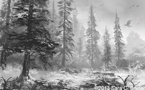
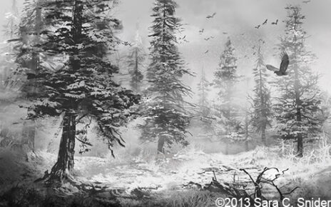
My first thought was, “wow.” Had I been forced to settle for one of the pictures as-was, I would have been pretty happy, even with it in black and white. But this was just a first draft.
So I considered what I liked and didn’t like about both pictures. That was really hard. Both pictures were good, each having its own strengths and weaknesses. The result was that I liked the trees in one picture, but liked the falcon in the other. I didn’t like all the birds in the sky, as it made me feel like there must have been a dead animal somewhere (which is probable, given it’s a forest, but not relevant for the purposes of the cover). I also didn’t like all the bracken on the ground, as I felt it made the forest look much harsher than I imagined and also might be too cluttered for the purposes of a book cover. There was also the ivy missing that I wanted on one of the trees. Ferdinand took the feedback and provided the third sketch.
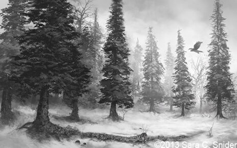
And there it was. The picture I had in my mind (or near enough, anyway), now sketched in black and white. I loved it. It had that calm, quiet feeling that I was looking for. I’m honestly still kind of amazed that Ferdinand was able to capture what I wanted so quickly. I approved the sketch and we moved on to the color study.
Please stay tuned for part two where I’ll share the colored versions of the sketches, and the bump in the road when I realized that a book cover needed to be more than just a pretty picture. Not to mention, of course, the final image that will be the cover of my book, The Thirteenth Tower.
You can find part two of this post here.
Beautiful! Makes me long for the forest.
Thanks, Missy! 🙂
Sara, I’m right here with you, sister.
I’m smack dab in the middle of having my cover designed by someone else, and I made that same mistake!
My guy designed a beautiful cover, but I had him put my antagonist instead of my protagonist, which I realized would not work, after he had already done it. He’s really patient with me too!
I can’t wait to see the next post! That’s a great picture!
Oh no, Katie! Seems like there should be a handbook somewhere on how to do this. 😉 Glad your guy is patient with you, really helps keep the feel-bads at bay. Looking forward to seeing your cover, too!
I like the wildness of the first draft but see/feel what you’re getting at with the second, approved version. Still, expectant, like it’s holding it’s breath. You’re really building anticipation for the actual book release; I can’t wait! =D
I like that description. My book isn’t exactly high-action, so I’m glad the cover is coming across as rather calm. Seems fitting.
Yay! I’m really excited for the book release, too! 😀