In part one of this post, I shared the black and white images of the cover art for my book, The Thirteenth Tower, drawn by the talented artist, Ferdinand Ladera. Now, in part two, it’s all about the colored versions. Most of the color studies are featured in this post, but not all. Some of the changes in a few of the images were so subtle that it seemed unnecessary including them.
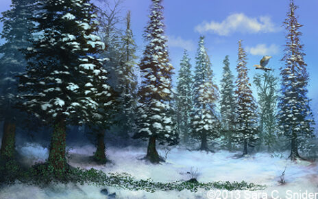
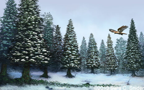
Without further ado, here’s the first color study Ferdinand supplied:
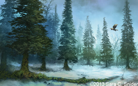
It was nice, but kind of glum and hazy, and there was no snow on the trees. I, being a busybody, had also noticed that in some of Ferdinand’s other work the sky often had different shades of color and I wondered if something similar would work here. So I asked him to toy with that along with the color of the ivy on the ground, just to see if something interesting could come of it. It backfired, and further solidified my suspicion that I really don’t know what the heck I’m talking about. I told him to ignore me and just keep on with the coloring like a sane person.
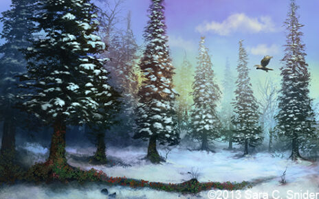
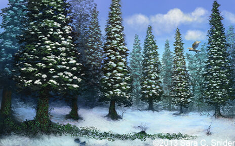
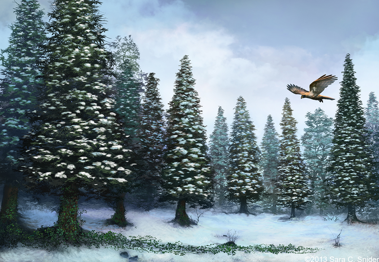
So the weird coloring was fixed, as was the ivy on the ground. Originally it had a dark shadow behind it that wasn’t really visible in the black and white version, but in the colored version it didn’t look quite right. So he removed the shadow and reworked the ivy a bit so it was more like tendrils twining along the ground. After that, it was just a matter of tweaking the background for less haziness and more clarity.
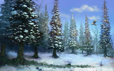
At this point, we were getting close. I still wasn’t completely happy with the trees. I wanted a bit more clarity and have them a bit more vibrant in color. Taking the feedback, Ferdinand produced this image:
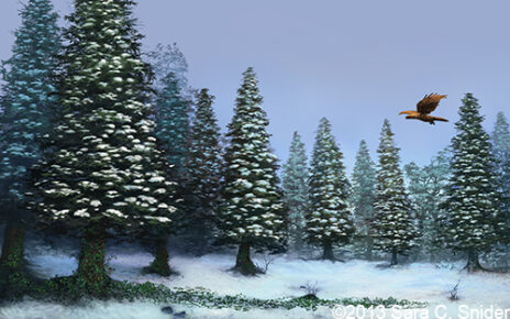
It was pretty much spot on. It looked great and, thinking it was what I wanted, we said that it would be the final image. So Ferdinand increased the resolution to our requested specs, added more detail, and sent the image to us for one final approval.
But I couldn’t give it. In the few days that passed between receiving the final image, I had this nagging feeling that the picture just wasn’t quite right. It was weird, because it was exactly what I asked for, yet I didn’t know if it was right, if it would make a good book cover.
So, Anders (my boyfriend and partner in crime publishing) shrunk it down to paperback-sized proportions, printed it out and wrapped it around a book. We then propped it up on a shelf and stood back to look at it. I’ll admit, after doing that it did look better. And it was kind of cool seeing it in book-form. Exciting. But in doing so, I realized one thing I didn’t like about it: it was too… blue.
Now, it was only that blue because I asked Ferdinand for vibrant color, and he delivered. At this point, though, I honestly had no idea how to fix it. I mean, I didn’t really know what I wanted anymore, so I wasn’t sure how to proceed.
So, we went to a fantasy and sci-fi bookstore to do a bit of recon on other book covers. Now, I always knew my cover would be a bit… abnormal. Most covers have people, but I specifically didn’t want a person on mine. Going to the bookstore just reinforced what I already knew: most book covers have people. It was encouraging, though, because some of the book covers were… well… let’s just say that even with an electric-blue sky, I still think my cover looked better than some of them.
Anyway, I wandered among the shelves for quite some time. I paid particularly close attention to the few covers that had landscapes, trying to see similarities and how they could be applied to my cover. One thing that stood out was that there was usually a fair amount of open space/sky. There was also a prominent feature somewhere, like a castle or animal. Looking at my cover I realized that the trees were too high, and the falcon too small.
We were then faced with a conundrum. Do we try to fix the picture as is, or scrap it completely and start over? Wandering through the bookstore gave me an idea for a cover that was completely different than what I had. Should I pursue that instead? It was a hard decision, as I think both types of cover could work.
Not wanting to completely abandon the original idea, Anders and I sat down and manipulated the picture in Photoshop to reflect the needed changes as best we could. We added text for the title and my name and everything, trying to get it looking like a book cover. We wanted to see if there was still potential for a cover that we both liked. I’m happy to say, there was.
So we mailed Ferdinand and explained the changes we wanted, and sent him a copy of our manipulations to illustrate what we meant. I was really worried that Ferdinand would be upset, that he wouldn’t want anything more to do with us. But he was super nice and said he’d be happy to do it.
Taking our latest changes into account, the picture then evolved into this:
A definite improvement. The sky was still a little too dark, and the falcon a little too small. I wanted some cloud textures and we played around a bit with the color of the falcon.
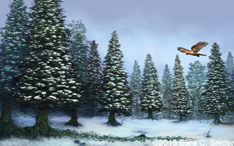
Almost there. Some adjustments to the sky ultimately led us to the final image. Again. (For reals, this time.)
 Click to enlarge
And there it is, the artwork that will serve as the cover for my book. Part of me is still unsure if will be a good book cover. I don’t know if it has that “oooh” factor that will draw people’s attention. But I love it, so that will be enough for me.
Perfect!!! I kept thinking the same thing, that there was no real subject. Making the falcon larger along with the other changes made it perfect. Well done!
Wow, thanks Lori! ‘Perfect’ is more than I could hope for. 🙂
I love watching the cover art steps and details evolve. It always makes me feel better to know that I’m not irrationally picky with my awesome, patient cover artist. I can’t wait to read your book, and love that you are giving it so much detail!
Thanks, Katie! 🙂 I definitely felt over-the-top picky sometimes. Having a patient artist really helps make the experience an enjoyable one.