For the cover of The Forgotten Web, I got to work with Jenny over at Seedlings Design Studio. She was a pleasure to work with–an absolute sweetheart and she knows her stuff. I highly recommend her. I figured I’d do the reveal for the cover like I did for The Thirteenth Tower, only it will be shorter, because there weren’t nearly as many revisions.
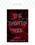
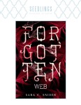
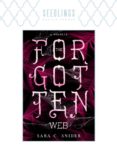
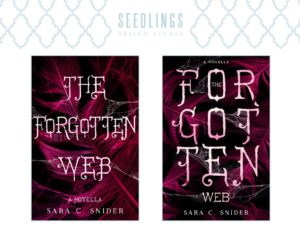
So! After settling on a few stock images and a font, this is what she sent me (click on the thumbnails to increase size):
I mean, I was pretty much already sold at this point. Both covers are lovely, and I really liked them both, though for different reasons. I liked the first one because it’s prettier (pretty… *pets it*) and because it ties in with the story really well. But the other one kind of “pops” you know? I felt (and still feel, actually) that it stands out on the screen better than the first one, and is potentially more of an attention-grabber. And that’s an important quality in a book cover.
I honestly couldn’t decide. I wanted to pick the first one because I liked it, but I felt like that I should perhaps pick the second one. In an attempt to make the first one stand out a bit more, we made some adjustments. The title was made larger at the expense of the margin (since it’s only going to be an ebook, you don’t need to worry about bleed like you do for print) and changed up the color a bit.
This was the result, along with the second cover I was leaning towards for comparison:
And then the deliberations…
I took a while to think about it. I asked around, and everyone else seemed to agree that the first one was the better cover. But I still honestly couldn’t decide until I talked with my sister-in-law, and she explained to me how she felt the second one seemed more like a general thriller novel, where the first one was much more intriguing to look at. I was inclined to agree–it does look kind of thriller-ish, and while The…Web might be kind of creepy, I wouldn’t call it a thriller. So that was really the push I needed to let me go with my heart (thanks, Nina!).
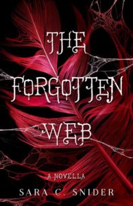
Once settled on the cover, I then decided that, despite my requests to make it so, the coloring was wrong, and that we should go back to the original red (though with some light accents to make it more “alive”). I also wanted to ditch the increased font size and bring back the margins. Jenny made it so, and sent me this cover:
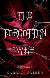
Almost there. The coloring was still a bit off. So Jenny darkened it, and then it was perfect. Ok, maybe not perfect, but I’m still in love, so who cares. Here’s the final cover:
The novella itself is nearly ready for publication and is currently going through a copy edit. I’m aiming for an April release, assuming I can manage to write a blurb I don’t hate. Which brings me to…
The Blurb
I’ve been struggling with writing the blurb for a while now. I think I get something decent, but when I go back to it later, I’m horrified at its awfulness. Anyway, here’s the latest iteration. Please feel free to flog it (in fact, it’s why I’m posting it here):
His memories become fractured and unclear, and Robin will struggle to define not only his identity, but also the confines of reality itself.
Given it’s such a short novel, I’m struggling with trying to make it sound intriguing but without giving too much away. I’d love to hear what you think!
Update:
OK, here’s the latest blurb I’ve written, for anyone who stumbles upon this post in the meanwhile:
But that which is unwoven can never be redone, and a life borne of blood carries an unimaginable price. Robin returns to a darkened world of shifting uncertainty that will threaten to tear apart his own identity, his perception of reality—and even his sanity.
Aaand attempt three…
But that which is unwoven can never be redone, and a life borne of blood carries a terrible price. Robin returns to a darkened world where shifting memories and tenuous realities threaten to tear apart the fabric of his sanity.
Love the cover, not sure about the blurb. Is there some way to incorporate the last sentence into the first bit? Some like “… simple life becomes anything but when a young weaver…” and “even though they weave his life anew, his memories become …”. It might feel more cohesive. Just a thought.
That’s a good suggestion. I’ll try it and see what I come up with. Thanks, Lori! 😀
I’m madly in love with Jenny, seriously. And this. looks. amazing.
She’s redoing two of my covers right now and I just can’t get over them! Seriously! She’s amaze balls. I’m so glad you went with her! And I have to say that the one you chose is the best. It’s perfect, and pops just like that second option in the top rows.
Which covers are you having redone? Because I think they all look really great.
And thanks! I’m glad I went with Jenny too. I love the cover, and now I’m wondering how I can make it work with her doing the cover for the sequel to The Thirteenth Tower…
Beautiful cover! I like the font. It’s very different. And I love the second paragraph of the updated blurb. The first paragraph doesn’t grab me the same way, though. It almost seems too matter of fact.
What if you did something like: “Robin Uwer is no more. A young Weaver, Fauwen, accidentally unraveled his existence — pulling him out of his world and into her own. He can’t go back. Refusing to accept that his old life is gone forever, he and Fauwen engage in blood magic and weave his life anew.” Just an idea…
Thanks, Lori! I also love that font. I think it’s perfect for the story.
Thanks for the feedback and suggestion! I’ve gotten some comments that the blurb needs a little more punch–maybe that first paragraph is the reason. I’ll look into livening it up a bit. Thanks! 🙂
Both covers are beautiful. The broken up FOR-GOT-TEN does look a lot like a thriller, in fact that’s what I though initially when I saw it – thriller/fantasy.
About Blurb attempt #3:
The last blurb has a haunting finish. But… it seems every sentence (and there are only 4) has a “webbing” word, (1-Weaver & unravel, 2-weave, 3-unwoven, 4-fabric) like your pushing the theme just a bit too much. Maybe opening it up in a more simpler sentence would make all the others pop out. For example, “Robin’s simple life is forever changed when a young Weaver named Fauwen pulls him out of his world and into her own.” Keep everything else the same, you can almost see the blurb crescendo from simple life to life threatening.
Also, I don’t know what’s entailed in the “unravels his existence” phrase, but you might give just a tiny bit more detail to give the reader a clue about what the Weaver does to actually pull him out of his world. Does she awaken him from a sleep? Is this cross-dimensional type of story? Unwraps him from a cocoon? Is it a dream sequence? Then you can replace that first sentence with “Robin’s simple life is forever changed when a young Weaver named Fauwen <> and traps him in her world.” ~ or something like that.
Just a few thoughts. Good luck!
the brackets are meant to contain the words “does something to Robin”. I guess the site took it away thinking it was unacceptable HTML. 🙂
Thanks Tanya! I can see what you mean about the thematic elements being a little OTT. In my mind, though, blurbs (and movie trailers and advertising in general) are usually pretty OTT. So… mission accomplished? 😉
Anyway, I really appreciate your input! I’ll definitely give it some thought. I am planning on publishing the novella at the end of the month, so I’m not sure how much I can bring myself to mess with it some more (ugh!). But I’ll definitely think about it. 😀
All I know is I love the concept and can’t wait to read it! When can I buy the book?!
You can buy it now. 🙂